Components / Layout & Overlay
Hero
Full-width banner for page headers with light and dark variants.
Light
Platform
Build the travel business
your customers deserve
Kaptio Travel Platform
End-to-end travel technology for tour operators, cruise lines, and DMCs. From inventory to checkout, powered by one connected platform.
Dark
Platform
Build the travel business
your customers deserve
Kaptio Travel Platform
End-to-end travel technology for tour operators, cruise lines, and DMCs. From inventory to checkout, powered by one connected platform.
Minimal
Components
Building blocks for Kaptio applications, styled with Flux design tokens.
With background accent
New Release
Introducing Voyage
Multi-day travel, reimagined
Purpose-built for cruise and rail operators. Cabin inventory, deck plans, and operational workflows for premium multi-day travel experiences.
With background image
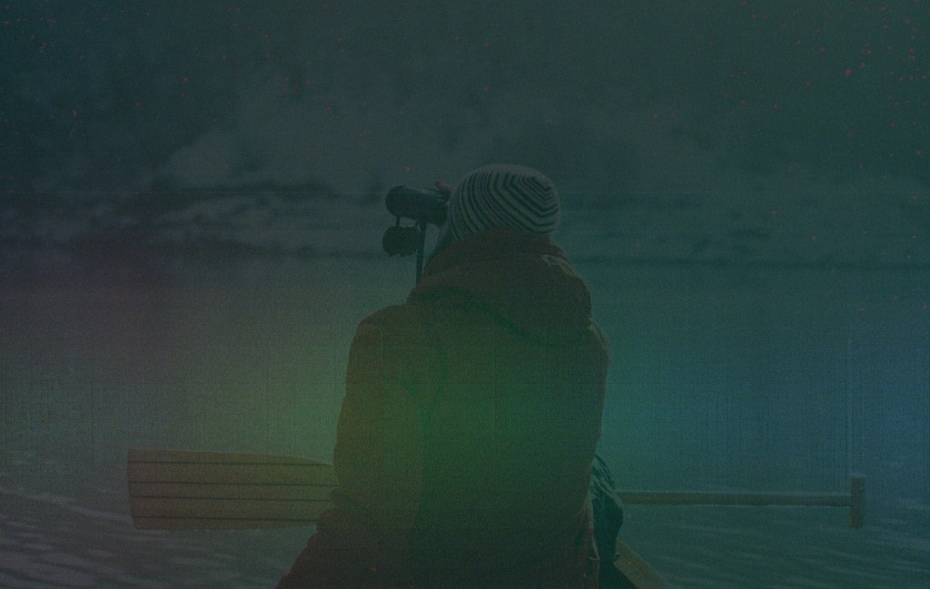
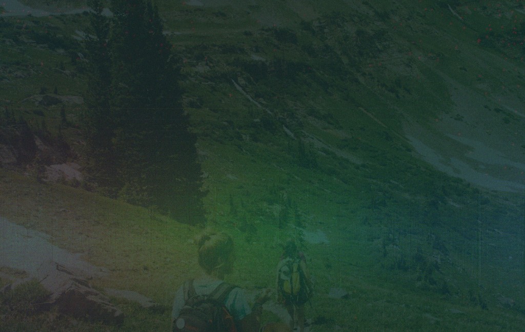
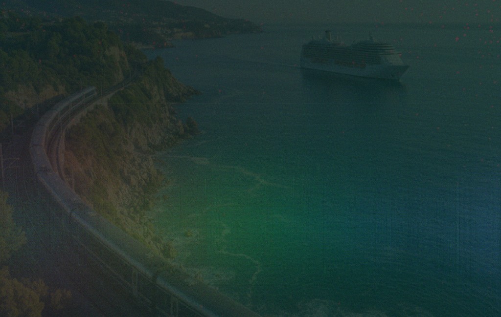
Quest
Find your next
adventure
Search · Compare · Book
Intelligent package search and availability for tour operators. Real-time pricing, flexible filtering, and instant booking.
Animated gradient
Next Generation
The future of
travel technology
AI-powered · Connected · Intelligent
A unified platform where every booking, every itinerary, and every guest interaction flows through one intelligent system.
Intro / Presentation Slide
Full-screen intro slide for presentations and screen sharing.Open full screen →
February 2026
Flux
Serve travellers not spreadsheets
Private & Confidential
Source HeroDemo.tsx
The exact code behind the live demo above. Fetch it raw at /components/source/hero.txt.
import { useState, useEffect, useCallback, useRef } from 'react';
import Grainient from '../Grainient';
import IntroSlide from '../IntroSlide';
const heroButtonStyles = `
.hero-btn {
cursor: pointer;
transition: all 0.15s ease;
display: inline-flex;
align-items: center;
gap: 0;
overflow: hidden;
}
.hero-btn::after {
content: '';
display: inline-block;
width: 0;
opacity: 0;
transition: width 0.2s ease, opacity 0.2s ease, margin 0.2s ease;
height: 14px;
margin-left: 0;
background-color: currentColor;
-webkit-mask-image: url("data:image/svg+xml,%3Csvg xmlns='http://www.w3.org/2000/svg' viewBox='0 0 16 16' fill='none' stroke='currentColor' stroke-width='2' stroke-linecap='round' stroke-linejoin='round'%3E%3Cpath d='M3.5 8h9M8.5 4l4 4-4 4'/%3E%3C/svg%3E");
mask-image: url("data:image/svg+xml,%3Csvg xmlns='http://www.w3.org/2000/svg' viewBox='0 0 16 16' fill='none' stroke='currentColor' stroke-width='2' stroke-linecap='round' stroke-linejoin='round'%3E%3Cpath d='M3.5 8h9M8.5 4l4 4-4 4'/%3E%3C/svg%3E");
-webkit-mask-size: contain;
mask-size: contain;
-webkit-mask-repeat: no-repeat;
mask-repeat: no-repeat;
flex-shrink: 0;
}
.hero-btn:hover::after {
width: 14px;
opacity: 1;
margin-left: 6px;
}
.hero-btn:focus-visible {
outline: 2px solid #FFBC42;
outline-offset: 2px;
}
.hero-btn-solid {
background-color: #034955;
color: #FFFFFF;
}
.hero-btn-solid:hover {
background-color: #02383F;
box-shadow: 0 4px 12px rgba(3,73,85,0.3);
}
.hero-btn-solid:active {
background-color: #032E36;
box-shadow: none;
}
.hero-btn-outline-light {
border: 1px solid #034955;
color: #034955;
background-color: transparent;
}
.hero-btn-outline-light:hover {
background-color: rgba(3,73,85,0.06);
border-color: #032E36;
color: #032E36;
}
.hero-btn-outline-light:active {
background-color: rgba(3,73,85,0.12);
}
.hero-btn-yellow {
border-radius: 4px;
opacity: 0.8;
background: #FFBC42;
color: #032E36;
box-shadow: 0 36px 80px 0 rgba(255,188,66,0.52), 0 15.04px 33.422px 0 rgba(255,188,66,0.37), 0 8.041px 17.869px 0 rgba(255,188,66,0.31), 0 4.508px 10.017px 0 rgba(255,188,66,0.26), 0 2.394px 5.32px 0 rgba(255,188,66,0.21), 0 0.996px 2.214px 0 rgba(255,188,66,0.15);
}
.hero-btn-yellow:hover {
opacity: 1;
box-shadow: 0 40px 90px 0 rgba(255,188,66,0.58), 0 18px 40px 0 rgba(255,188,66,0.42), 0 10px 22px 0 rgba(255,188,66,0.35), 0 6px 12px 0 rgba(255,188,66,0.28), 0 3px 6px 0 rgba(255,188,66,0.22), 0 1px 3px 0 rgba(255,188,66,0.16);
}
.hero-btn-yellow:active {
opacity: 1;
background: #E8A830;
box-shadow: 0 20px 50px 0 rgba(255,188,66,0.4), 0 8px 20px 0 rgba(255,188,66,0.28), 0 4px 10px 0 rgba(255,188,66,0.2);
}
.hero-btn-ghost {
border: 1px solid rgba(255,255,255,0.3);
color: #FFFFFF;
background-color: transparent;
}
.hero-btn-ghost:hover {
background-color: rgba(255,255,255,0.1);
border-color: rgba(255,255,255,0.5);
}
.hero-btn-ghost:active {
background-color: rgba(255,255,255,0.15);
border-color: rgba(255,255,255,0.5);
}
.hero-btn-ghost-blur {
border: 1px solid rgba(255,255,255,0.3);
color: #FFFFFF;
background-color: rgba(255,255,255,0.06);
}
.hero-btn-ghost-blur:hover {
background-color: rgba(255,255,255,0.14);
border-color: rgba(255,255,255,0.5);
}
.hero-btn-ghost-blur:active {
background-color: rgba(255,255,255,0.2);
border-color: rgba(255,255,255,0.5);
}
.hero-slide {
position: absolute;
inset: 0;
opacity: 0;
transition: opacity 0.6s ease;
}
.hero-slide.active {
opacity: 1;
}
.hero-slide img {
width: 100%;
height: 100%;
object-fit: cover;
}
.hero-vnav {
position: absolute;
right: 24px;
top: 50%;
transform: translateY(-50%);
display: flex;
flex-direction: column;
align-items: center;
gap: 0;
z-index: 10;
}
.hero-vnav-item {
display: flex;
align-items: center;
gap: 10px;
cursor: pointer;
background: none;
border: none;
padding: 8px 0;
position: relative;
}
.hero-vnav-dot {
width: 12px;
height: 12px;
border-radius: 50%;
border: 2px solid rgba(255,255,255,0.5);
background: transparent;
transition: all 0.25s ease;
flex-shrink: 0;
position: relative;
z-index: 2;
}
.hero-vnav-item:hover .hero-vnav-dot {
border-color: #FFFFFF;
}
.hero-vnav-item.active .hero-vnav-dot {
border-color: #FFFFFF;
background: #FFFFFF;
}
.hero-vnav-label {
position: absolute;
right: 22px;
white-space: nowrap;
font-size: 11px;
font-weight: 700;
letter-spacing: 0.05em;
color: rgba(255,255,255,0.45);
transition: all 0.2s ease;
}
.hero-vnav-item:hover .hero-vnav-label,
.hero-vnav-item.active .hero-vnav-label {
color: #FFFFFF;
}
.hero-vnav-line {
width: 2px;
flex: 1;
background: rgba(255,255,255,0.2);
min-height: 20px;
}
`;
function Section({ title, children }: { title: string; children: React.ReactNode }) {
return (
<div className="mb-8">
<h3 className="text-sm font-bold text-[var(--flux-heading)] mb-3">{title}</h3>
{children}
</div>
);
}
const imageSlides = [
{
label: 'Quest',
image: '/images/hero-quest.png',
badge: 'Quest',
heading: <>Find your next<br />adventure</>,
sub: 'Search \u00b7 Compare \u00b7 Book',
body: 'Intelligent package search and availability for tour operators. Real-time pricing, flexible filtering, and instant booking.',
cta: 'Search packages',
},
{
label: 'Circle',
image: '/images/hero-circle.png',
badge: 'Circle',
heading: <>Connect every<br />guest touchpoint</>,
sub: 'CRM \u00b7 Loyalty \u00b7 Engagement',
body: 'A unified guest platform that brings together profiles, preferences, and interactions across every channel.',
cta: 'Explore Circle',
},
{
label: 'Voyage',
image: '/images/hero-travel.png',
badge: 'Voyage',
heading: <>Travel without<br />boundaries</>,
sub: 'Cruise \u00b7 Rail \u00b7 Touring',
body: 'From coastal cruises to scenic rail journeys, one platform to manage every departure, cabin, and guest experience.',
cta: 'Explore packages',
},
];
function ImageHeroSlider() {
const [active, setActive] = useState(0);
const goTo = useCallback((i: number) => setActive(i), []);
useEffect(() => {
const timer = setInterval(() => {
setActive(prev => (prev + 1) % imageSlides.length);
}, 6000);
return () => clearInterval(timer);
}, [active]);
const slide = imageSlides[active];
return (
<Section title="With background image">
<div
className="w-full rounded overflow-hidden relative"
style={{ minHeight: 400 }}
>
{imageSlides.map((s, i) => (
<div key={s.label} className={`hero-slide ${i === active ? 'active' : ''}`}>
<img src={s.image} alt={s.label} />
</div>
))}
<div
className="absolute inset-0"
style={{ background: 'linear-gradient(135deg, rgba(3,46,54,0.45) 0%, rgba(3,46,54,0.1) 100%)' }}
/>
<div className="relative px-8 sm:px-12 py-14 sm:py-20" style={{ minHeight: 400 }}>
<p
className="text-xs font-light tracking-widest uppercase mb-4"
style={{ color: '#FFBC42' }}
>
{slide.badge}
</p>
<h1
className="text-3xl sm:text-5xl font-bold tracking-tight mb-3"
style={{ color: '#FFFFFF' }}
>
{slide.heading}
</h1>
<p
className="text-sm font-light mb-5"
style={{ color: '#FFBC42' }}
>
{slide.sub}
</p>
<p
className="text-base max-w-lg leading-relaxed mb-8"
style={{ color: 'rgba(255,255,255,0.85)' }}
>
{slide.body}
</p>
<div className="flex flex-wrap gap-3">
<button className="hero-btn hero-btn-yellow font-bold text-sm px-5 py-2.5">
{slide.cta}
</button>
<button className="hero-btn hero-btn-ghost rounded-[4px] font-bold text-sm px-5 py-2.5">
Learn more
</button>
</div>
</div>
<div className="hero-vnav">
{imageSlides.map((s, i) => (
<div key={s.label} className="flex flex-col items-center">
<button
className={`hero-vnav-item ${i === active ? 'active' : ''}`}
onClick={() => goTo(i)}
aria-label={s.label}
>
<span className="hero-vnav-label">{s.label}</span>
<span className="hero-vnav-dot" />
</button>
{i < imageSlides.length - 1 && <div className="hero-vnav-line" />}
</div>
))}
</div>
</div>
</Section>
);
}
function GrainientHero() {
const centerRef = useRef<{ x: number; y: number }>({ x: 0, y: 0 });
const containerRef = useRef<HTMLDivElement>(null);
const handleMouseMove = useCallback((e: React.MouseEvent<HTMLDivElement>) => {
const el = containerRef.current;
if (!el) return;
const rect = el.getBoundingClientRect();
centerRef.current = {
x: ((e.clientX - rect.left) / rect.width - 0.5) * 0.3,
y: -((e.clientY - rect.top) / rect.height - 0.5) * 0.3,
};
}, []);
const handleMouseLeave = useCallback(() => {
centerRef.current = { x: 0, y: 0 };
}, []);
return (
<Section title="Animated gradient">
<div
ref={containerRef}
className="w-full rounded overflow-hidden relative"
style={{ minHeight: 400, cursor: 'crosshair' }}
onMouseMove={handleMouseMove}
onMouseLeave={handleMouseLeave}
>
<div className="absolute inset-0">
<Grainient
color1="#ffbc42"
color2="#062e36"
color3="#de38a4"
timeSpeed={0.7}
colorBalance={-0.75}
warpStrength={0.75}
warpFrequency={3.1}
warpSpeed={2}
warpAmplitude={64}
blendAngle={13}
blendSoftness={0.43}
rotationAmount={500}
noiseScale={2}
grainAmount={0.1}
grainScale={2}
grainAnimated={false}
contrast={1.5}
gamma={1}
saturation={1}
centerX={0}
centerY={0}
zoom={0.9}
centerRef={centerRef}
/>
</div>
<div className="relative px-8 sm:px-12 py-14 sm:py-20 flex flex-col justify-center" style={{ minHeight: 400 }}>
<p
className="text-xs font-light tracking-widest uppercase mb-4"
style={{ color: '#FFBC42' }}
>
Next Generation
</p>
<h1
className="text-3xl sm:text-5xl font-bold tracking-tight mb-3"
style={{ color: '#FFFFFF' }}
>
The future of
<br />travel technology
</h1>
<p
className="text-sm font-light mb-5"
style={{ color: '#FFBC42' }}
>
AI-powered · Connected · Intelligent
</p>
<p
className="text-base max-w-lg leading-relaxed mb-8"
style={{ color: 'rgba(255,255,255,0.85)' }}
>
A unified platform where every booking, every itinerary, and every
guest interaction flows through one intelligent system.
</p>
<div className="flex flex-wrap gap-3">
<button className="hero-btn hero-btn-yellow font-bold text-sm px-5 py-2.5">
Get early access
</button>
<button className="hero-btn hero-btn-ghost-blur rounded-[4px] font-bold text-sm px-5 py-2.5 backdrop-blur-sm">
Watch demo
</button>
</div>
</div>
</div>
</Section>
);
}
export default function HeroDemo() {
return (
<>
<style>{heroButtonStyles}</style>
<Section title="Light">
<div
className="w-full rounded px-8 sm:px-12 py-12 sm:py-16"
style={{ backgroundColor: 'var(--flux-background)', border: '1px solid var(--flux-grey-100)' }}
>
<p
className="text-xs font-bold tracking-widest uppercase mb-4"
style={{ color: '#056F82' }}
>
Platform
</p>
<h1
className="text-3xl sm:text-4xl font-bold tracking-tight mb-3"
style={{ color: '#032E36' }}
>
Build the travel business
<br />your customers deserve
</h1>
<p
className="text-sm font-bold mb-5"
style={{ color: '#976100' }}
>
Kaptio Travel Platform
</p>
<p
className="text-base max-w-xl leading-relaxed mb-8"
style={{ color: '#6B7280' }}
>
End-to-end travel technology for tour operators, cruise lines, and DMCs.
From inventory to checkout, powered by one connected platform.
</p>
<div className="flex flex-wrap gap-3">
<button className="hero-btn hero-btn-solid rounded-[4px] font-bold text-sm px-5 py-2.5">
Get started
</button>
<button className="hero-btn hero-btn-outline-light rounded-[4px] font-bold text-sm px-5 py-2.5">
View documentation
</button>
</div>
</div>
</Section>
<Section title="Dark">
<div
className="w-full rounded px-8 sm:px-12 py-12 sm:py-16"
style={{ backgroundColor: '#032E36' }}
>
<p
className="text-xs font-light tracking-widest uppercase mb-4"
style={{ color: '#FFBC42' }}
>
Platform
</p>
<h1
className="text-3xl sm:text-4xl font-bold tracking-tight mb-3"
style={{ color: '#FFFFFF' }}
>
Build the travel business
<br />your customers deserve
</h1>
<p
className="text-sm font-light mb-5"
style={{ color: '#FFBC42' }}
>
Kaptio Travel Platform
</p>
<p
className="text-base max-w-xl leading-relaxed mb-8"
style={{ color: 'rgba(255,255,255,0.85)' }}
>
End-to-end travel technology for tour operators, cruise lines, and DMCs.
From inventory to checkout, powered by one connected platform.
</p>
<div className="flex flex-wrap gap-3">
<button className="hero-btn hero-btn-yellow font-bold text-sm px-5 py-2.5">
Get started
</button>
<button className="hero-btn hero-btn-ghost rounded-[4px] font-bold text-sm px-5 py-2.5">
View documentation
</button>
</div>
</div>
</Section>
<Section title="Minimal">
<div
className="w-full rounded px-8 sm:px-12 py-10 sm:py-14"
style={{ backgroundColor: '#032E36' }}
>
<h1
className="text-3xl sm:text-4xl font-bold tracking-tight mb-3"
style={{ color: '#FFFFFF' }}
>
Components
</h1>
<p
className="text-base max-w-lg leading-relaxed"
style={{ color: 'rgba(255,255,255,0.7)' }}
>
Building blocks for Kaptio applications, styled with Flux design tokens.
</p>
</div>
</Section>
<Section title="With background accent">
<div
className="w-full rounded px-8 sm:px-12 py-12 sm:py-16 relative overflow-hidden"
style={{ backgroundColor: '#032E36' }}
>
<div
className="absolute top-0 right-0 w-72 h-72 rounded-full opacity-10"
style={{
background: 'radial-gradient(circle, #FFBC42 0%, transparent 70%)',
transform: 'translate(30%, -30%)',
}}
/>
<div className="relative">
<p
className="text-xs font-light tracking-widest uppercase mb-4"
style={{ color: '#FFBC42' }}
>
New Release
</p>
<h1
className="text-3xl sm:text-4xl font-bold tracking-tight mb-3"
style={{ color: '#FFFFFF' }}
>
Introducing Voyage
</h1>
<p
className="text-sm font-light mb-5"
style={{ color: '#FFBC42' }}
>
Multi-day travel, reimagined
</p>
<p
className="text-base max-w-xl leading-relaxed"
style={{ color: 'rgba(255,255,255,0.85)' }}
>
Purpose-built for cruise and rail operators. Cabin inventory, deck plans,
and operational workflows for premium multi-day travel experiences.
</p>
</div>
</div>
</Section>
<ImageHeroSlider />
<GrainientHero />
<Section title="Intro / Presentation Slide">
<p className="text-sm text-[var(--flux-black)] mb-3">
Full-screen intro slide for presentations and screen sharing.
<a href="/intro" className="ml-1 text-[var(--flux-link)] hover:text-[var(--flux-link-hover)] transition-colors">
Open full screen →
</a>
</p>
<div className="w-full rounded overflow-hidden" style={{ aspectRatio: '16 / 9' }}>
<IntroSlide fullScreen={false} />
</div>
</Section>
</>
);
}